
A powerful coaching website is essential for life and business coaches looking to attract more clients and grow their practice. In today’s digital age, most clients begin their search for coaches online, which makes it crucial for coaches to have an outstanding online presence. In this article, we will explore the most effective coaching websites, top tips for creating your own site, and the best website templates and builders to help you take your coaching business to the next level.
The Importance of a Great Coaching Website
An exceptional coaching website is the cornerstone of any successful coaching practice. It serves as a virtual storefront, allowing potential clients to discover your services, engage with your content, and ultimately, decide whether to work with you. A well-designed website can:
- Make it easier for people to find you online
- Capture their attention and spark interest
- Establish trust and credibility
- Present your services in a compelling way
- Facilitate smooth communication and booking processes
By investing in a high-quality coaching website, you can enhance your online visibility, boost client acquisition, and elevate your overall brand image.
Looking to get coaching clients? Here’s an article on that.
Top 16 Coaching Websites to Learn From
To help you gain a better understanding of what makes an excellent coaching website, I’ve compiled a list of 20 examples from popular coaches with that you can draw inspiration from.
I’ll explain what I like about each one, and what sites I think leave something to be desired + what I would change.
Basic criteria
I’ll be using the following 5 criteria to gauge my personal opinion of each website. I was a marketing manager for 7 years, have had an online business since 2011, and have also worked with and managed development and user experience teams. So, I have some kind of basis for my opinions.
- Above the fold: what is my first impression of the site, and what shows up “above the fold”? (This refers to what you see on a web page before you scroll.)
- Messaging: How easy is it for me to understand who this is and what they’re about? Do I understand their niche in 2 seconds or less?
- Navigation: How’s the menu? Can I get oriented easily and click around to find out about their stuff?
- General Appearance: What’s my personal opinion of the vibe?
- Lead magnet or contact: Is there a mega easy way for me to join their email list, find them on social, or ask a question?
Other caveats:
- I’m not doing any research about many of these people, and I don’t know who many of them are. I simply asked ChatGPT what some “top coaches” were, and then narrowed down the list a bit.
- I’m only looking at the home page. For some people, a home page gets a lot of traffic, but for others who use SEO and ads, their home page may not get any traffic at all, or hardly any. This is important to note because I’m evaluating the home page as if it’s a MAIN page for people – but the reality is that it may NOT be. In other words: I may audit home pages below that people aren’t trying that hard to optimize, or don’t care about.
Have a blog? You might want to read this post about making a good first impression with your blogging website.
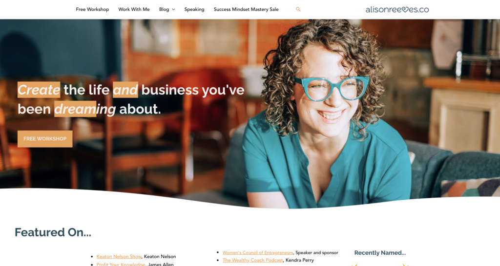
Tony Robbins – www.tonyrobbins.com
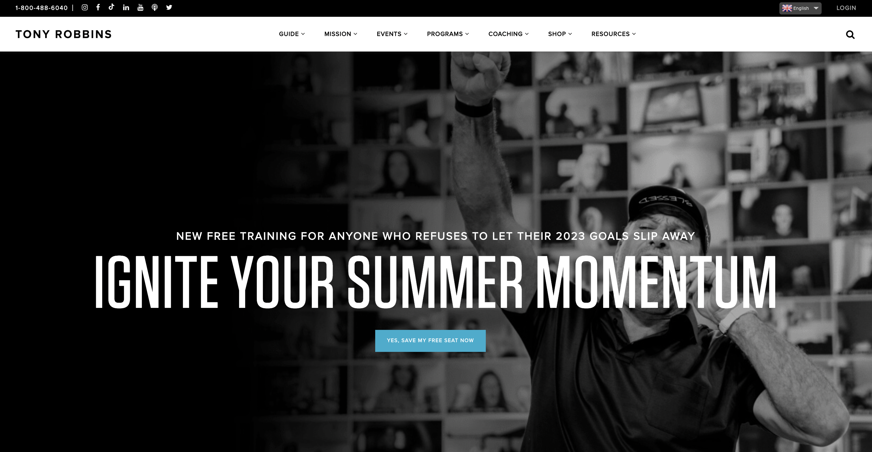
Above the fold on Tony’s website, we see the main thing he’s known for and what he wants you to do: RSVP for an event. While the event name isn’t super specific, you get the vibe right away that it has to do with personal development.
His tagline after a few more images is:
MASTER EVERY AREA OF YOUR LIFE: SOLUTIONS TO FIT YOUR TIME, YOUR LIFESTYLE AND YOUR BUDGET
Messaging
I would describe this tagline as “fine”. Like, he’s Tony heckin’ Robbins, so go off. But to me, this doesn’t really say much. It’s trying to appeal to everyone, which is something you can do when you’re Tony Heckin’ Robbins. But most of you (us) need to be way more specific, especially in the life coaching and personal development niches. Your niche doesn’t have to be narrow and inflexible. In fact, I can pretty much guarantee you’ll pivot more than once in your business. But before you’re well known like T-slice, you really need to be specific enough to help people understand: why you.
The navigation and overall design are sleek – I love them.
Menu: If you go under “Guide” there are about 400 options. (Okay, only 9, but wow it’s still a lot.) For most people I recommend keeping your menu simple. In fact, if you’re client roster isn’t full for coaching, I’d probably only direct people to either book a call or get your lead magnet. (And to your blog if you have one). Summary: I like the primary menu, but I think there’s a ton of options under each primary navigation. A ton = too many for most of us if we want users to DO something specific.
If you scroll down, you’ll see case studies and another call to action to RSVP for an event. I like that the home page stays focused on that.
Martha Beck – www.marthabeck.com
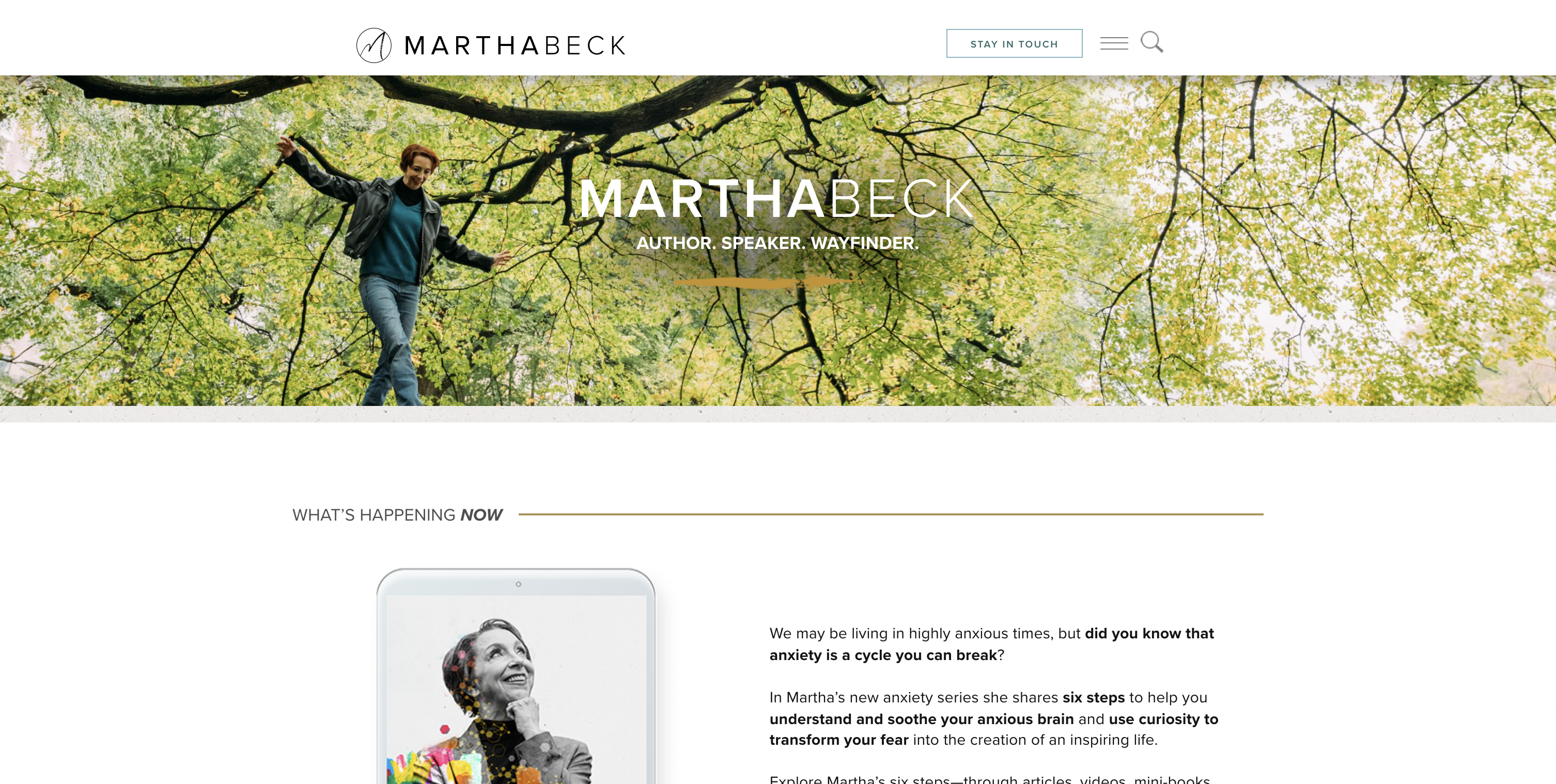
The next of the coaching websites: Martha Beck.
I’ll say right off the bat that this design wasn’t as striking / attractive to my at Tony Robbins’.The hero image on the top took up around half of the “above the fold” area I saw before scrolling, and then the section below it felt more like an internal page than a home page. I think if the “what’s happening now” were much bigger it would help this look more designed – but these are all just subjective opinions.
A popup came up the first time I visited the site, and the call to action was pretty generic (along the lines of “join my newsletter”). This probably works for Martha, but for most of us, I’d recommend trying an opt-in that is more specific and value or results driven. (Like a training, ebook, quiz or other tool.)
Messaging
The tagline “AUTHOR. SPEAKER. WAYFINDER.” doesn’t tell me much, but the section below the hero image does. Well, at least it tells me ONE thing: that Martha is doing a series on anxiety and finding calm. The third section is an “about” section which tells you more about Martha, and this is where it is finally clear to me what her niche is: she’s a sociologist and author. While the top of the page does say she’s an author, knowing that she’s a Harvard trained sociologist helped me get the vibe more.
As I scroll down I like the design and layout better than these top sections.
Her menu is a hamburger menu on the top right. (The 3 little lines.) This is usually a mobile website layout for menus, but I see more and more desktops using this minimal approach. From a user experience perspective, I’m guessing some people would lack an intuition that the menu is on the top right like that. I’m making this assumption because I’m guessing her crowd is more mature, like she is.
Her menu has 14 items, which is pretty epic and probably why she opted for a hamburger menu. Unlike Tony, there isn’t an epic amount of options under those 14 options, so in that regard, it’s more minimalist than Tony.
Gabrielle Bernstein – www.gabbybernstein.com
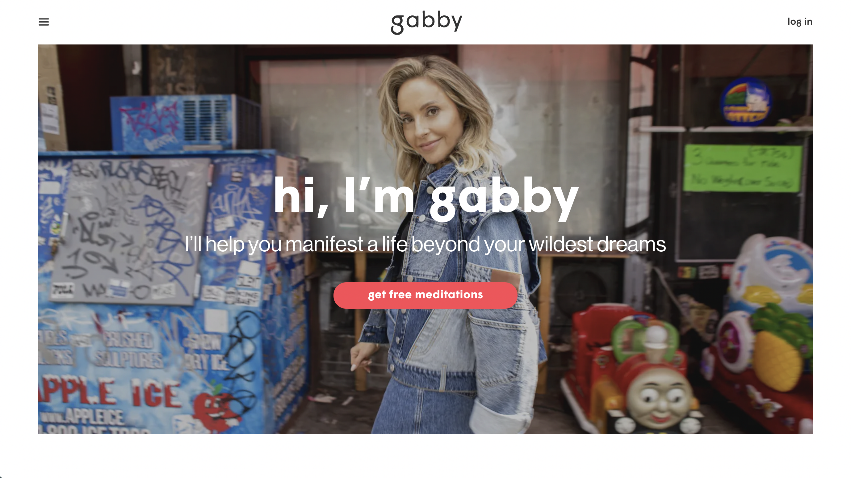
Gabby Bernstein’s homepage is simple, but honestly, I’m obsessed with it. I love the photo she chose – it feels posed but still authentic.
I also think the tagline is clear, AND I love the opt-in she chose. This feels like a very simple but focused “above the fold” section.
Her menu is a hamburger menu like Martha’s above, but unlike Martha’s, her menu is more focused. It has 6 items only.
Lead Magnet Versus Newsletter
In addition to the “free meditations” at the top of the page, which feels like a very specific lead magnet and value proposition, she ALSO has a newsletter subscription form at the bottom. I used to be somewhat anti-newsletter as an online marketer that thought “no one wants a newsletter”. Except for…I like newsletters. And so do a lot of other folks. For some, newsletters aren’t enough of a value proposition to join your email list. That’s why we also want to bribe people for their email with something specific.
I like that Gabby does both.
(And I subscribed to her newsletter…)
Brendon Burchard – www.brendon.com
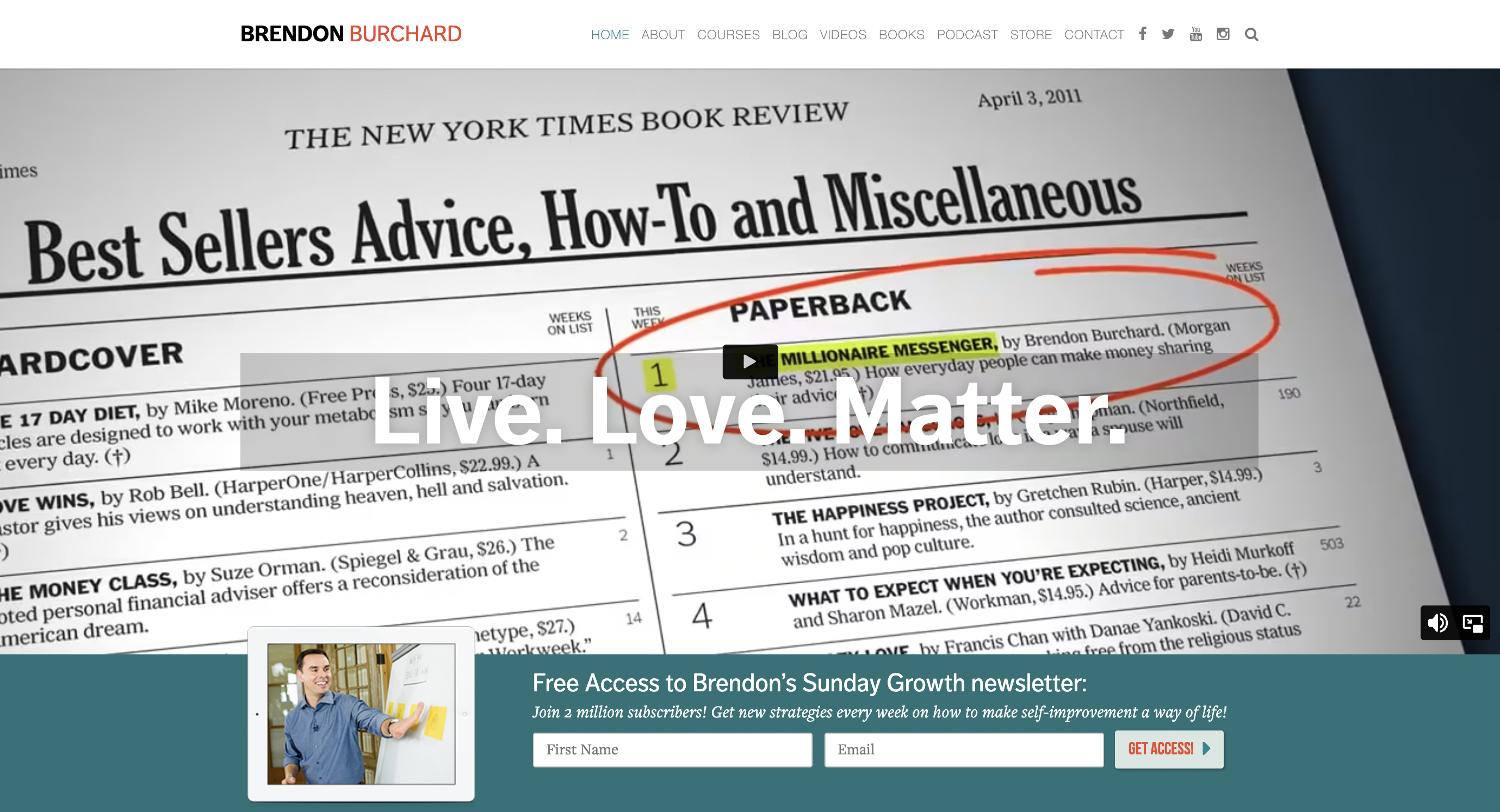
Review coming
Cheryl Richardson – www.cherylrichardson.com
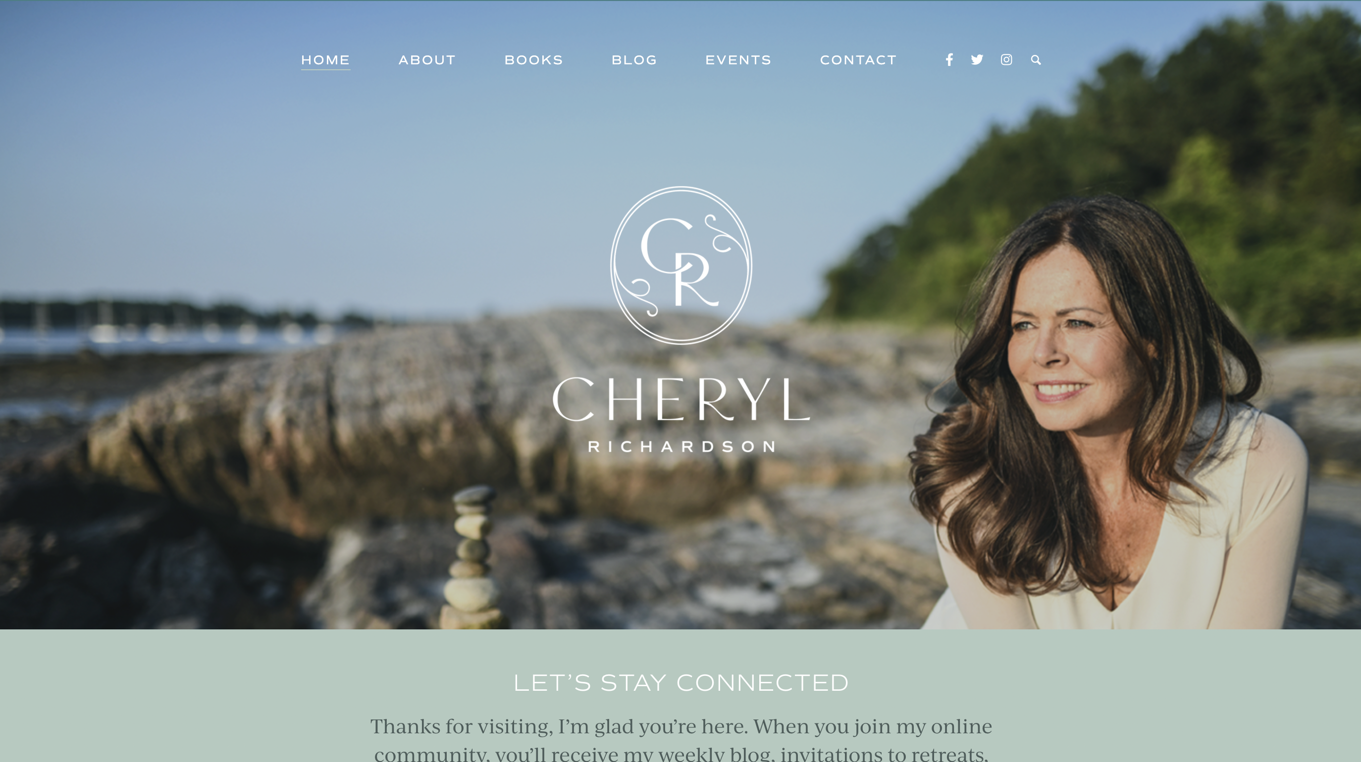
Review coming
Tim Ferriss – www.tim.blog
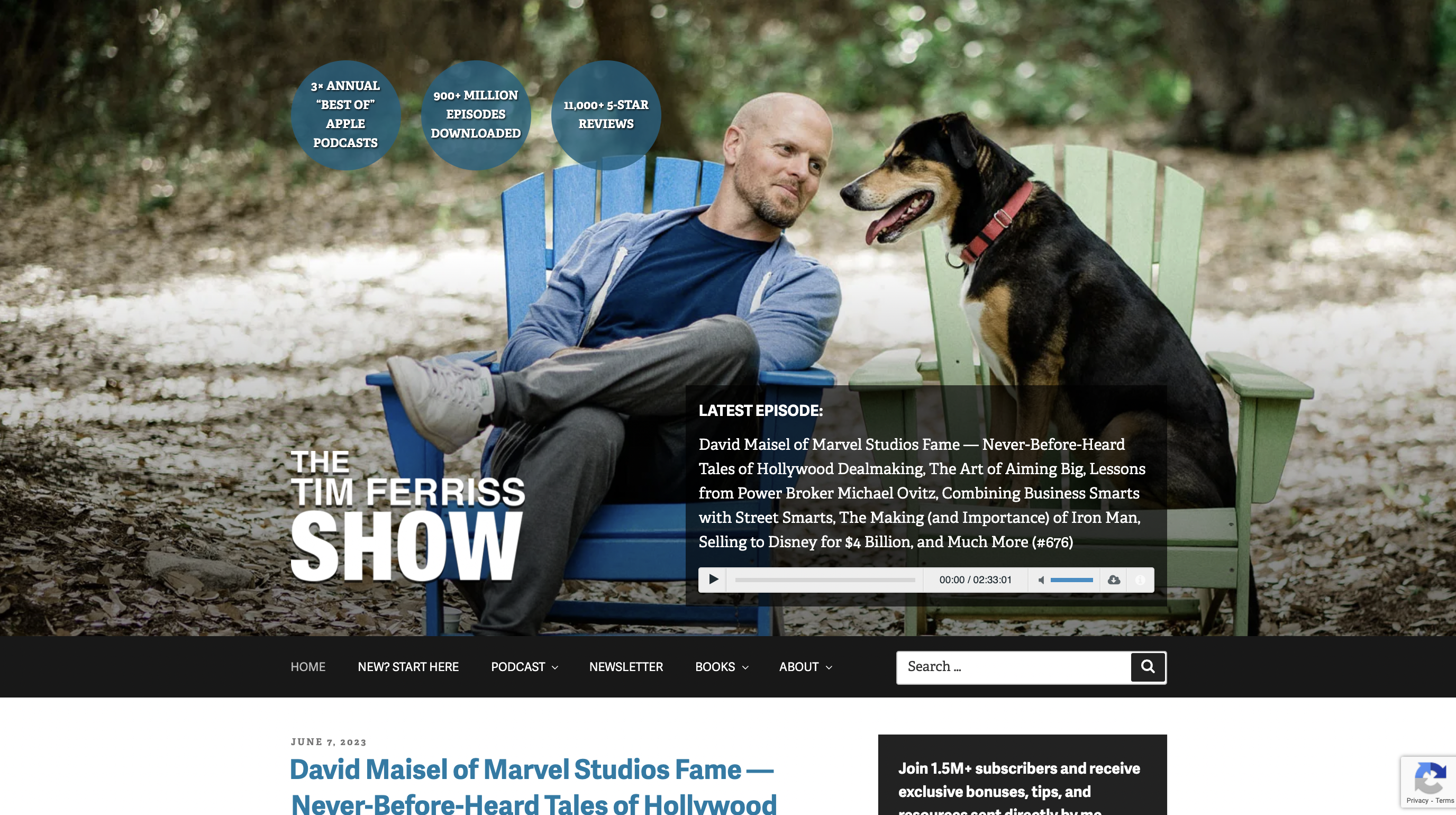
Review coming
Leo Babauta – www.zenhabits.net
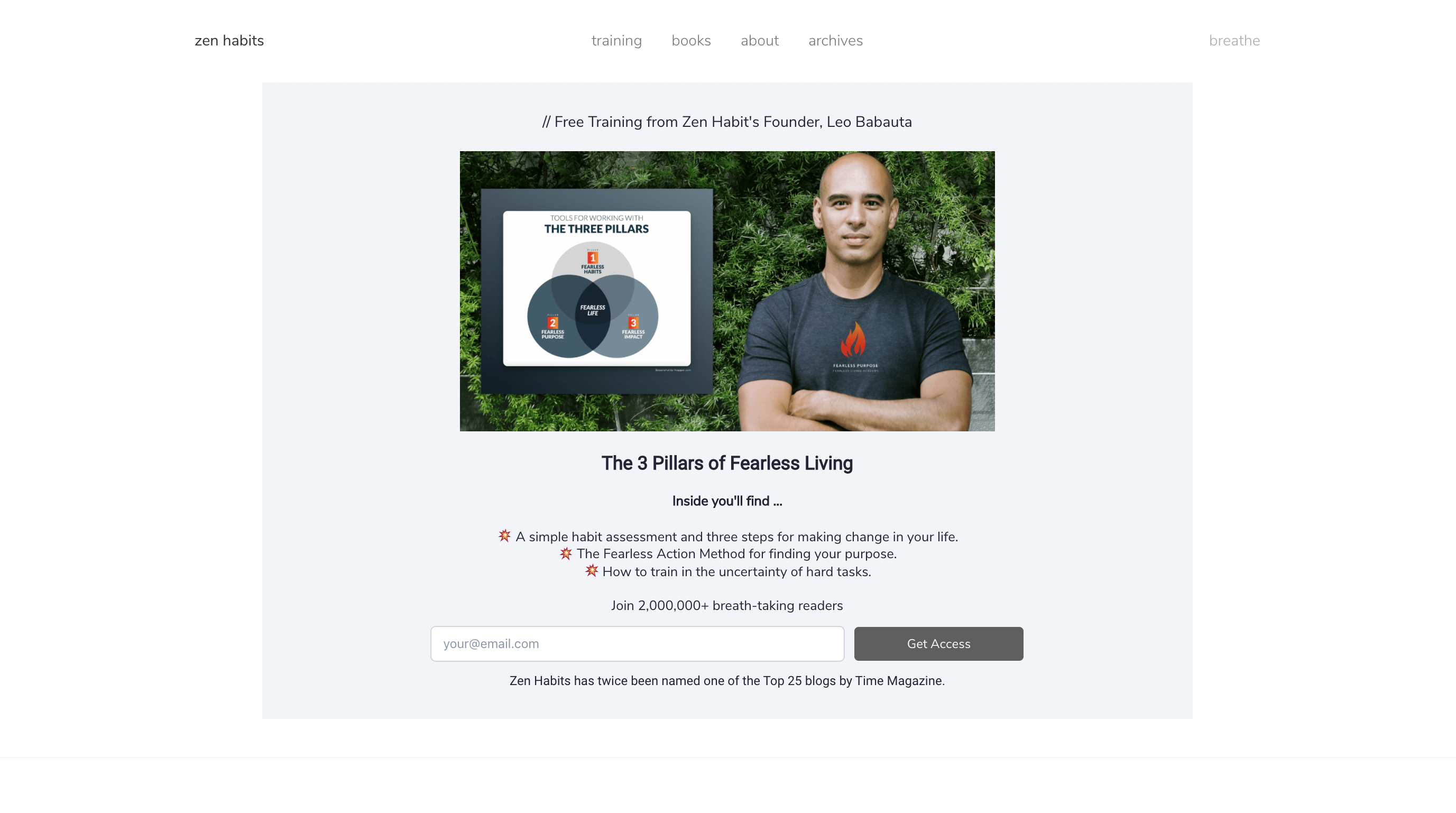
Review coming
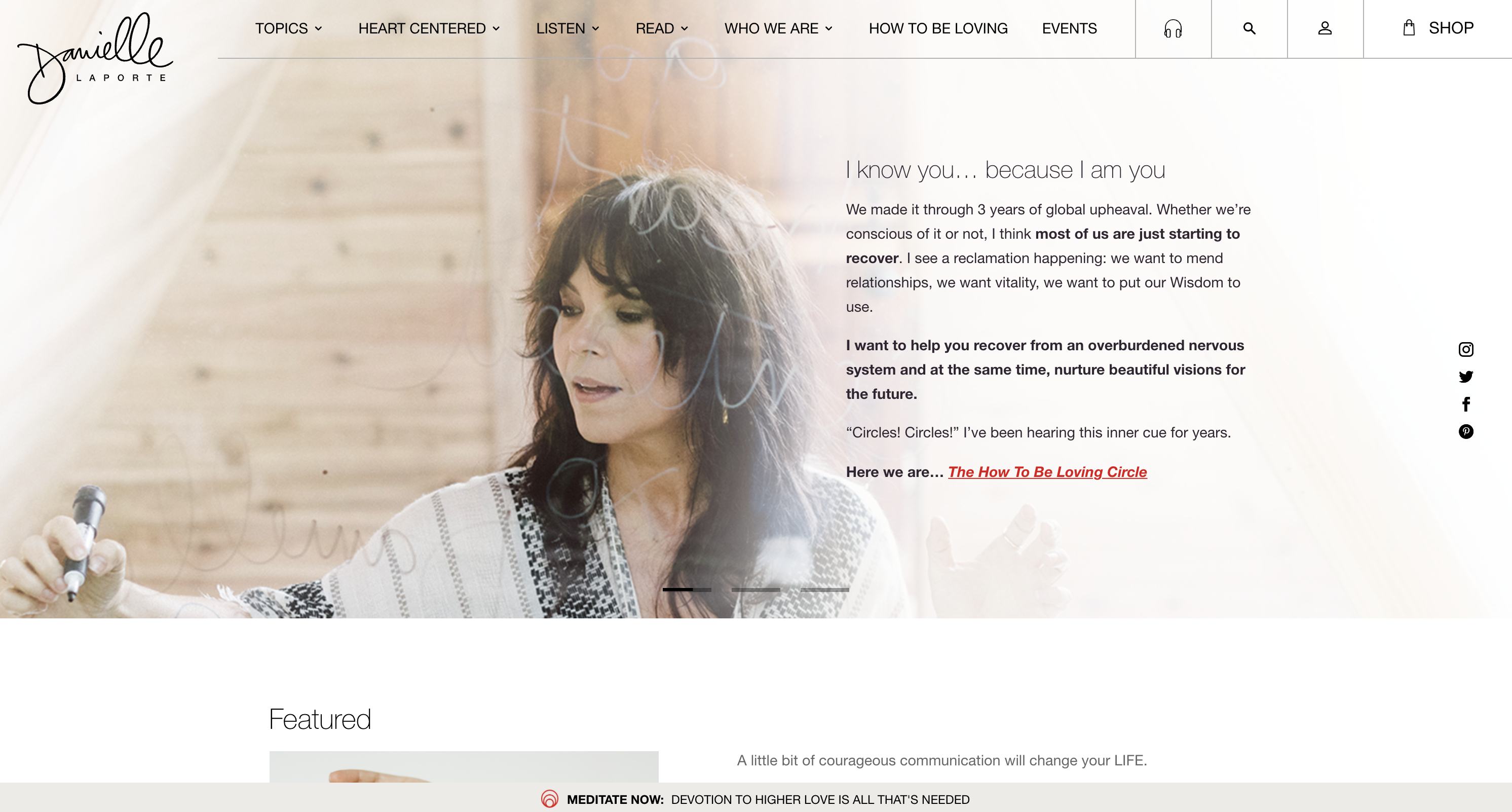
Danielle LaPorte – www.daniellelaporte.com
Review coming
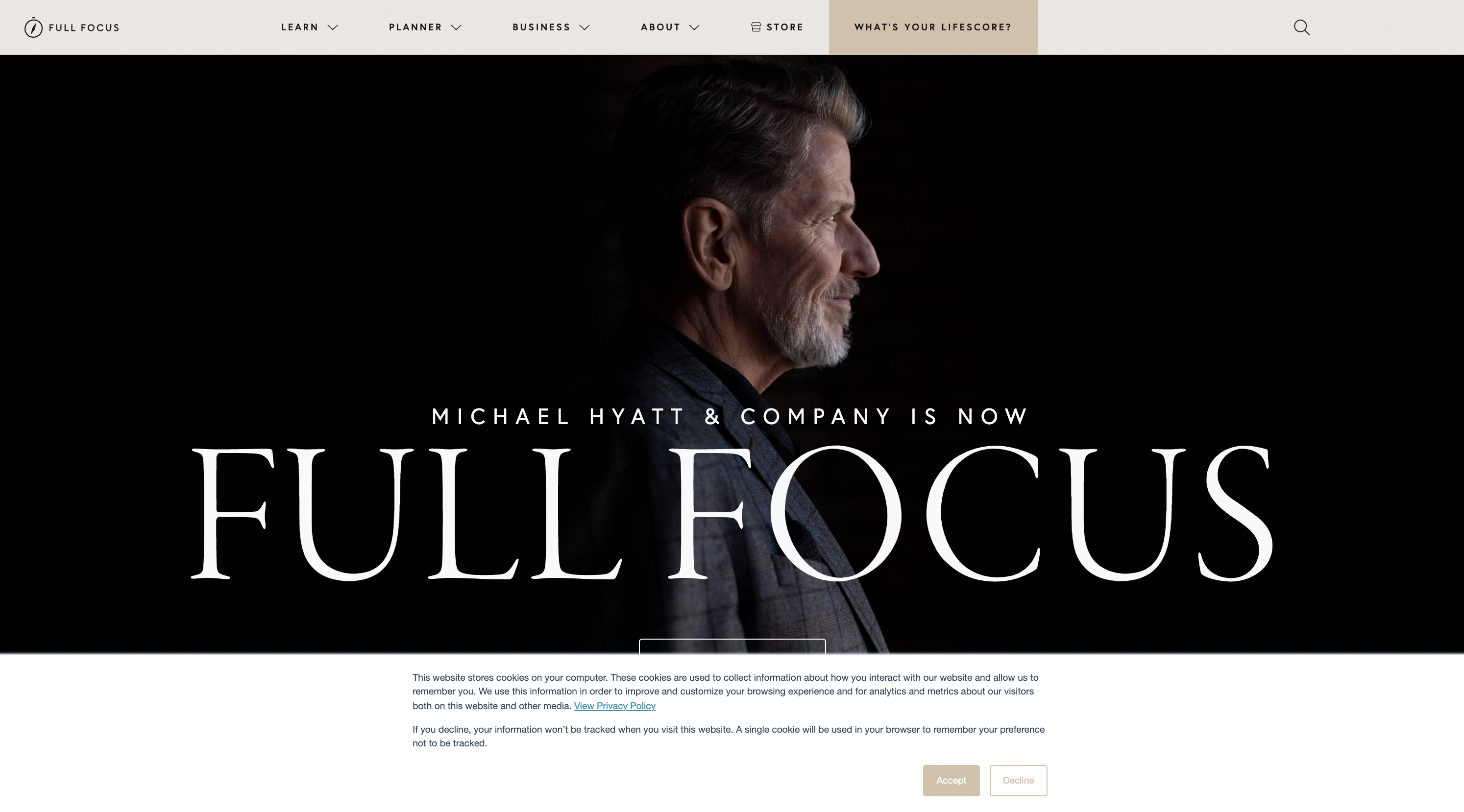
Michael Hyatt – www.michaelhyatt.com
Review coming
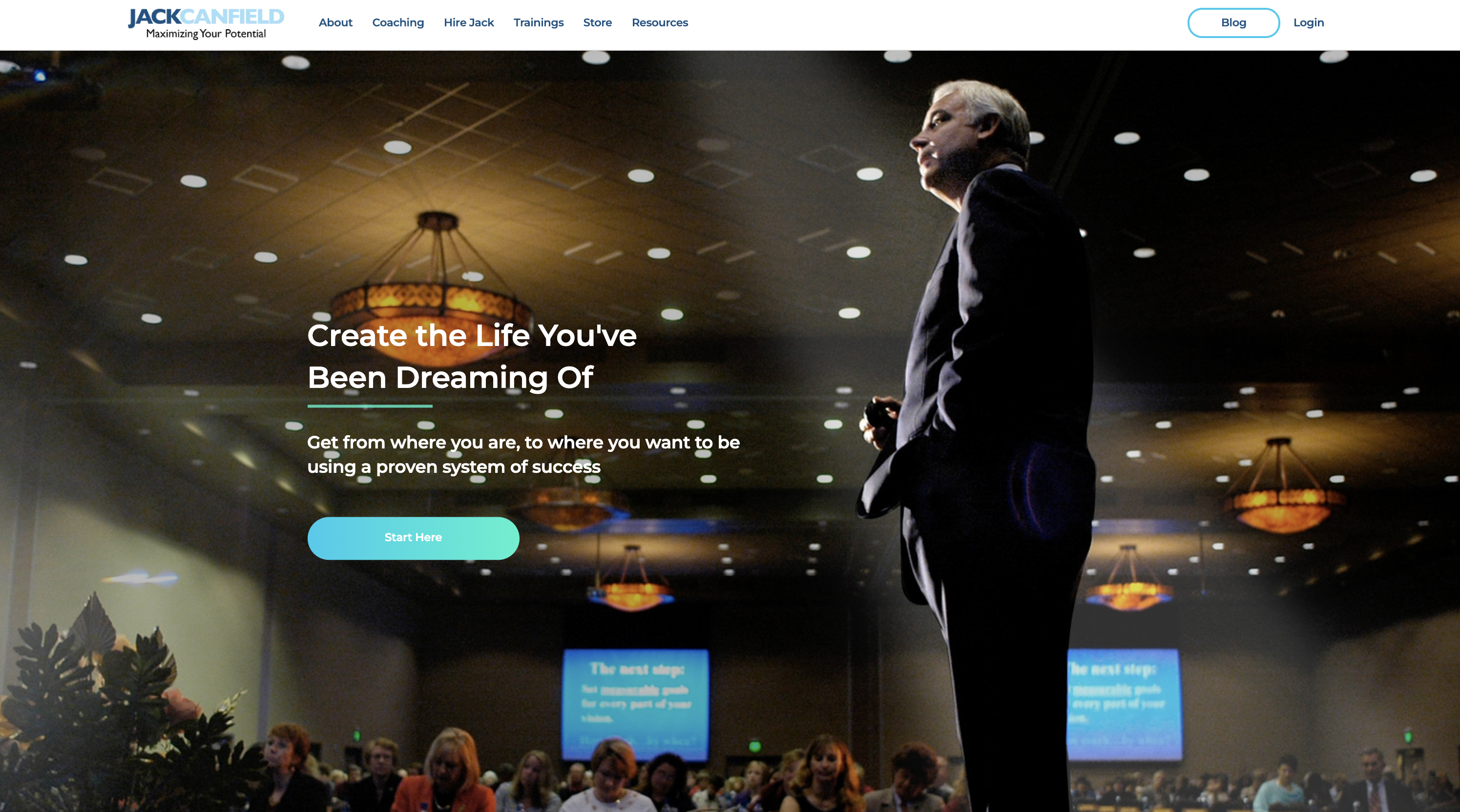
Jack Canfield – www.jackcanfield.com
Review coming
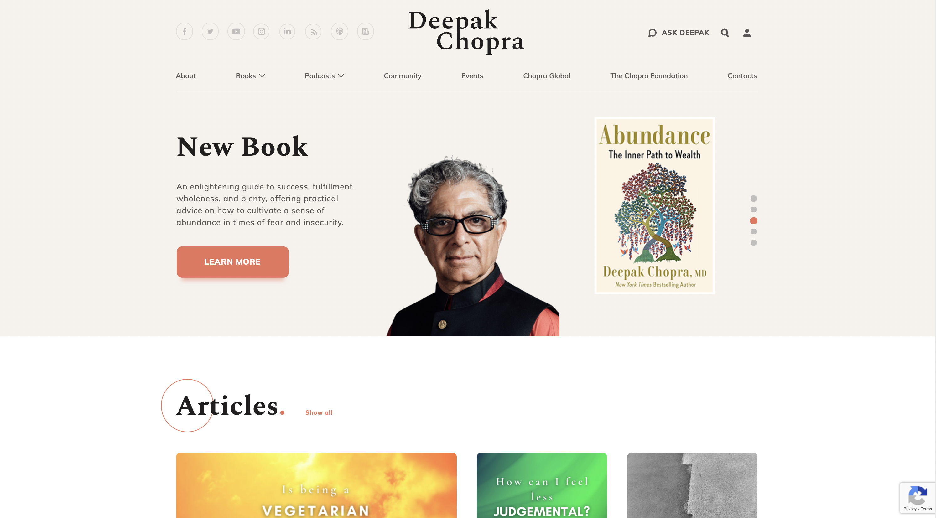
Deepak Chopra – www.deepakchopra.com
Review coming
Susan David – www.susandavid.com
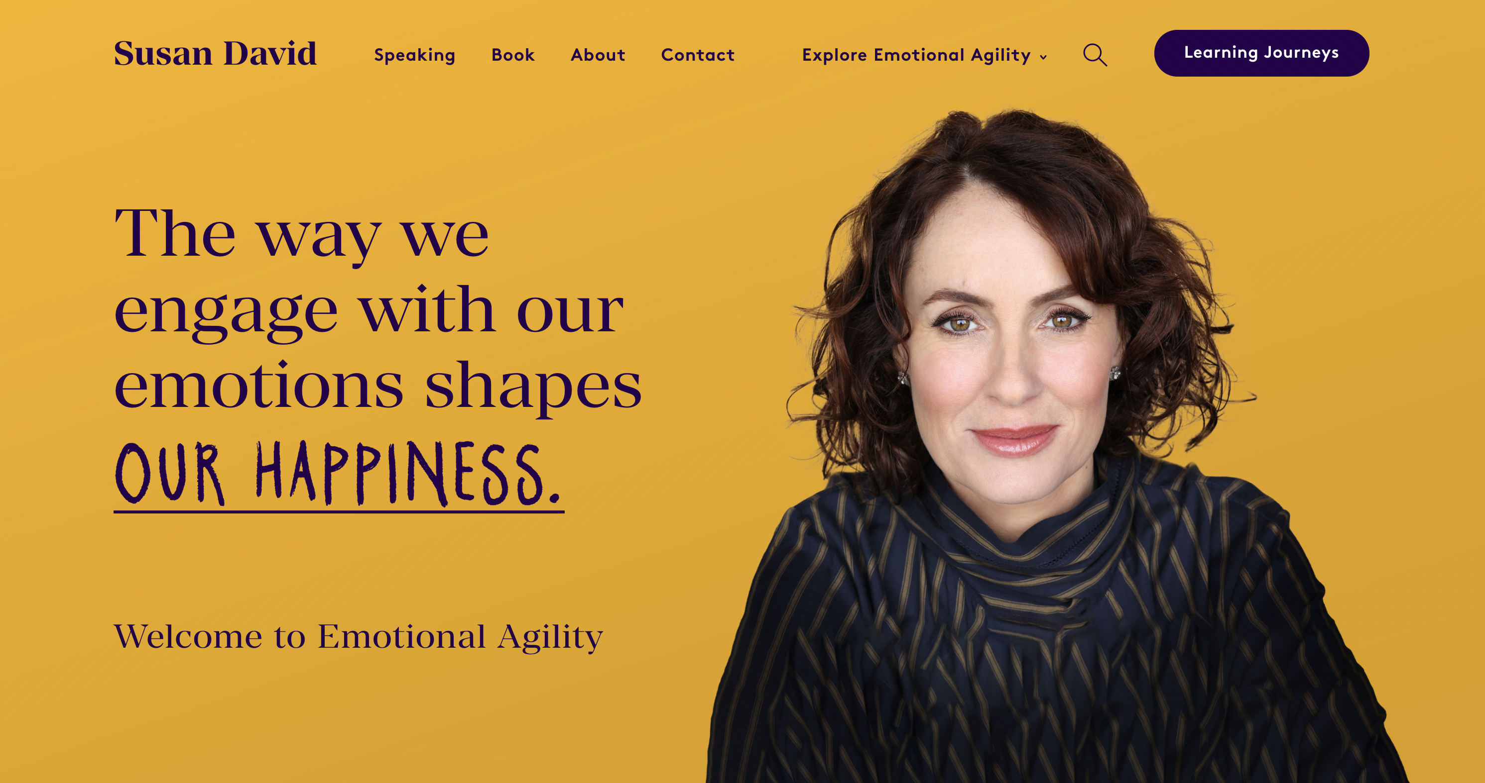
Review coming
Rhonda Britten – www.fearlessliving.org
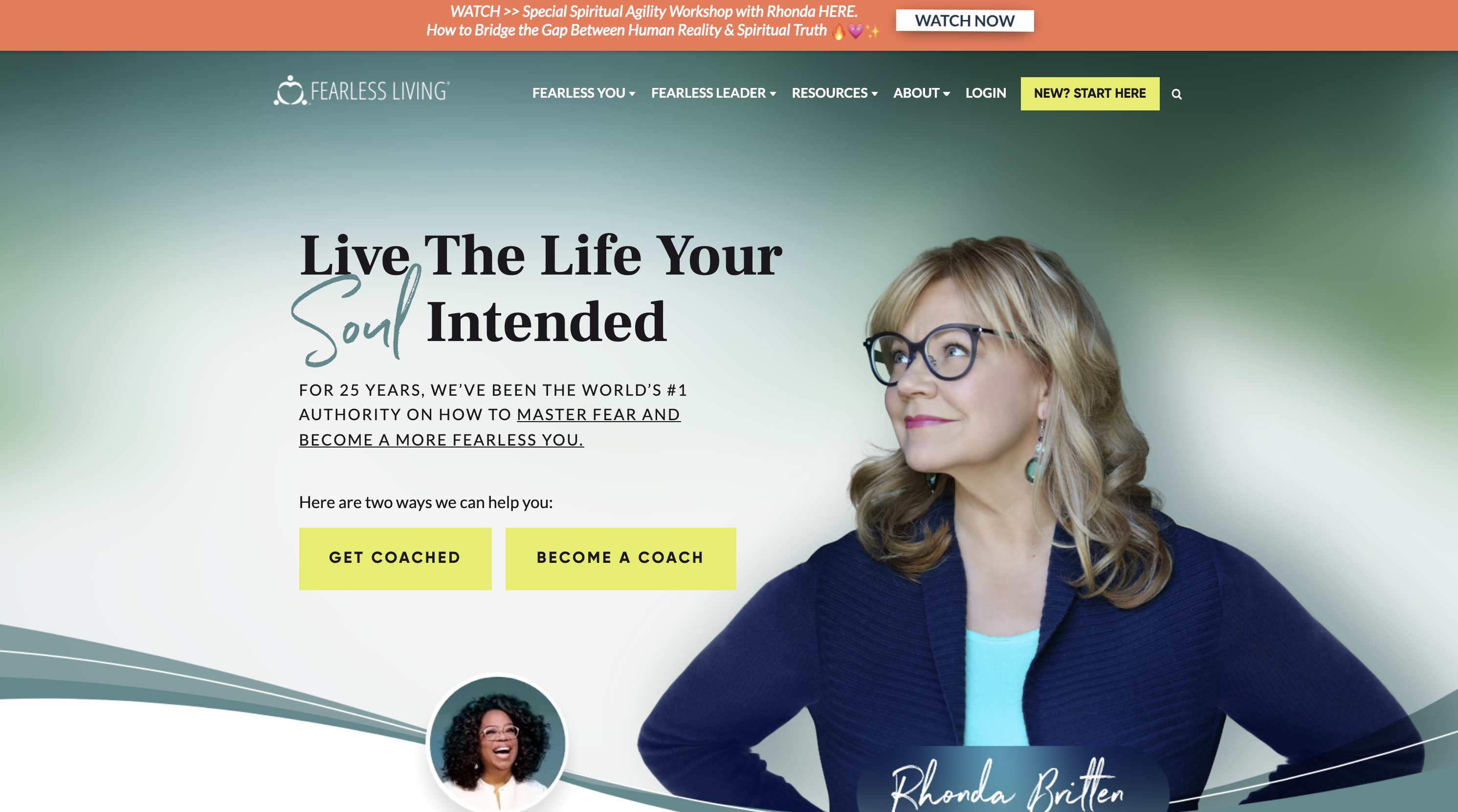
Review coming
Jim Rohn – www.jimrohn.com
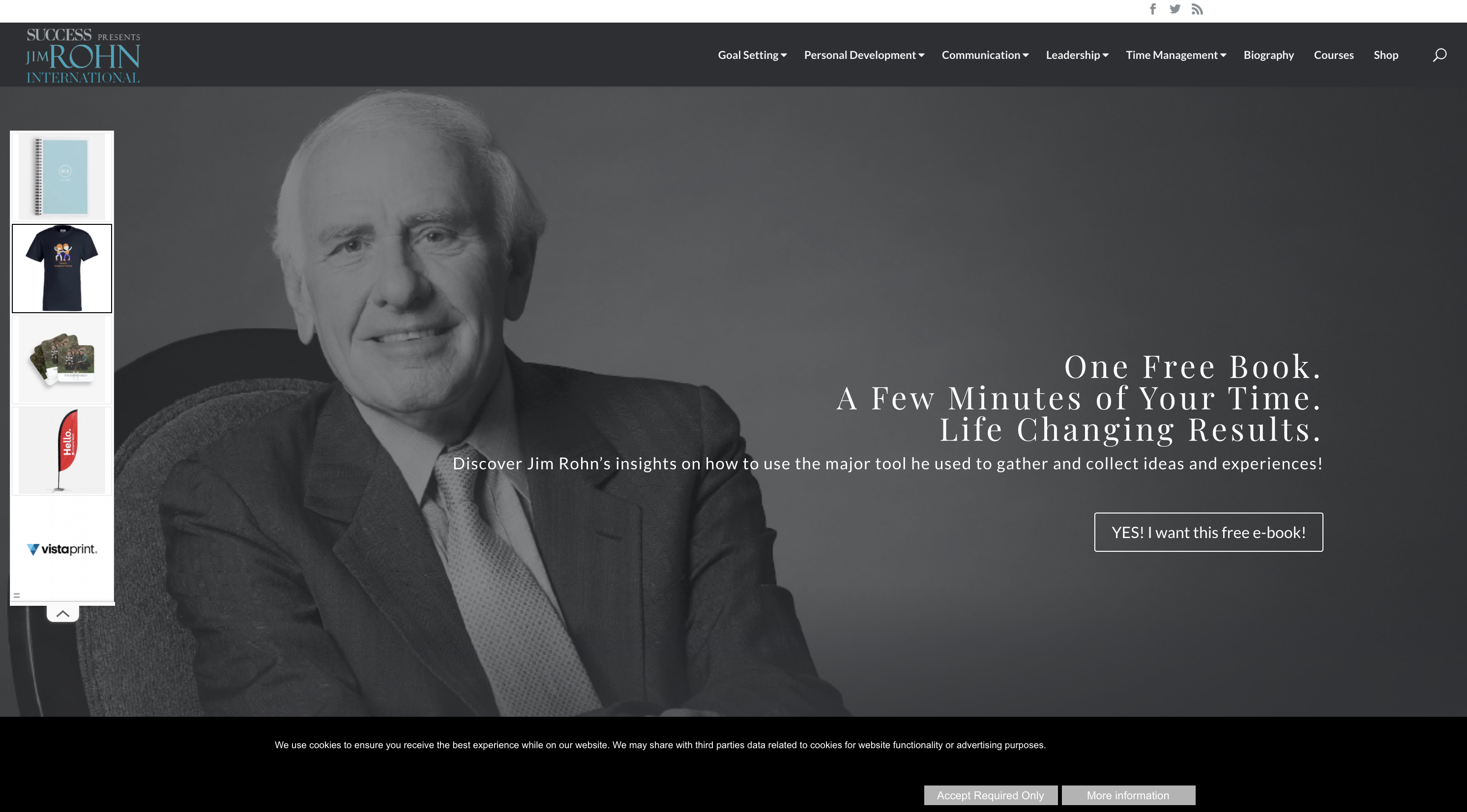
Review coming
Top Tips for Creating Your Own Coaching Website
With the above examples as inspiration, let’s delve into some essential tips for creating your own coaching website:
- Engaging and professional images: High-quality photos of yourself are crucial for establishing credibility and making a strong first impression.
- A statement or tagline: Clearly convey your specialty and the results clients can expect from working with you.
- Call to Action: Guide visitors through the actions you want them to take on your website.
- Free resources: Offer valuable content, such as blog posts, podcasts, or guides, to build relationships and foster trust with your audience.
- Great structure: Design your website with a user-friendly layout, ensuring it is visually appealing and easy to navigate.
- Clear services: Be explicit about the services you offer so that potential clients can easily identify which option is the right fit for them.
The Best Coaching Website Templates
When it comes to building your coaching website, there are several popular platforms to choose from, such as WordPress, Squarespace, and Showit.
The Best WordPress Coaching Website Theme
I personally use Astra, which has a free or paid version. I like it because it’s a blank slate, and I can design the pages however I want with Elementor (what I use), or Divi or other page builders.
Ashe is another great, free theme I’ve used in the past, and is great for beginners – but it’s very blog focused.
I stay away from themes that are too designed or rigid, because in my experience, you’ll hit walls with them. The learning curve and flexibility of Astra and Elementor is well worth the learning curve in the beginning.
The Best Squarespace Coaching Website Templates
I have a few clients who use Squarespace, but I don’t have a particular theme I like. Because Squarespace is a drag and drop editor, I would find a Squarespace site you like, and then copy it as you learn how to use the editor.
Squarespace has limitations in my opinion – but a lot of my clients think it is more beginner friendly.
Elevating Your Coaching Business with a Powerful Website
A well-designed coaching website is the foundation of a thriving coaching practice.
By following the tips and examples outlined in this article, you can create an exceptional online presence that captivates potential clients and sets you apart from the competition.
Embrace the empowering, supportive, and authentic tone of voice that resonates with your target audience, and watch your coaching business reach new heights.
Free: Mindful Marketing Newsletter
Join 6,500 others on our newsletter.